Lettering and a fading moon
The Oborozuki identity brings together two different textures: the uneven edges of brush lettering and the smooth fade of a circular moon. Teal connects them, with white space around the mark.
Building the mark
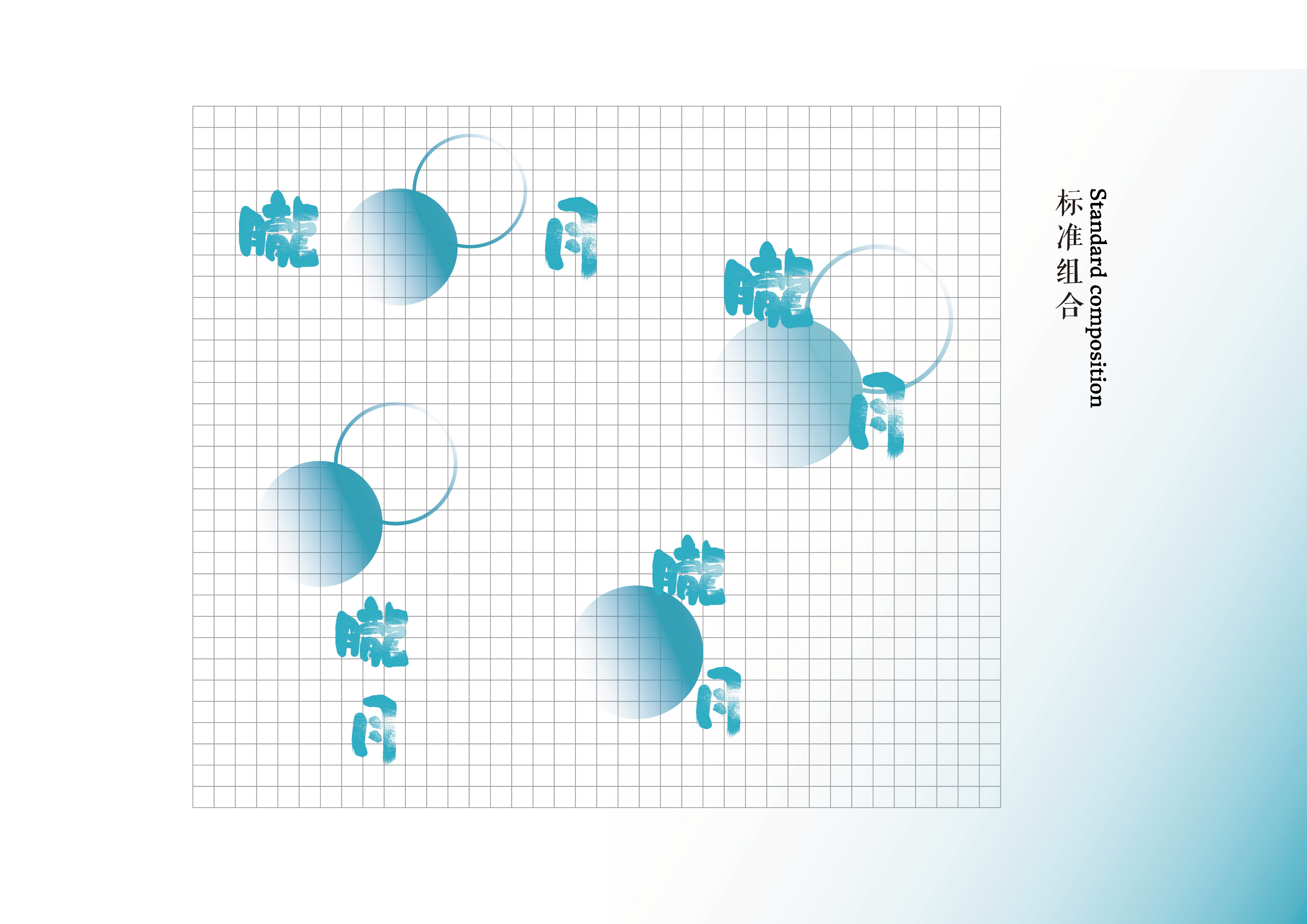
I combined the lettering with a filled circle and an overlapping circular outline. A teal-to-white gradient softens the filled shape and lets part of it disappear into the background.
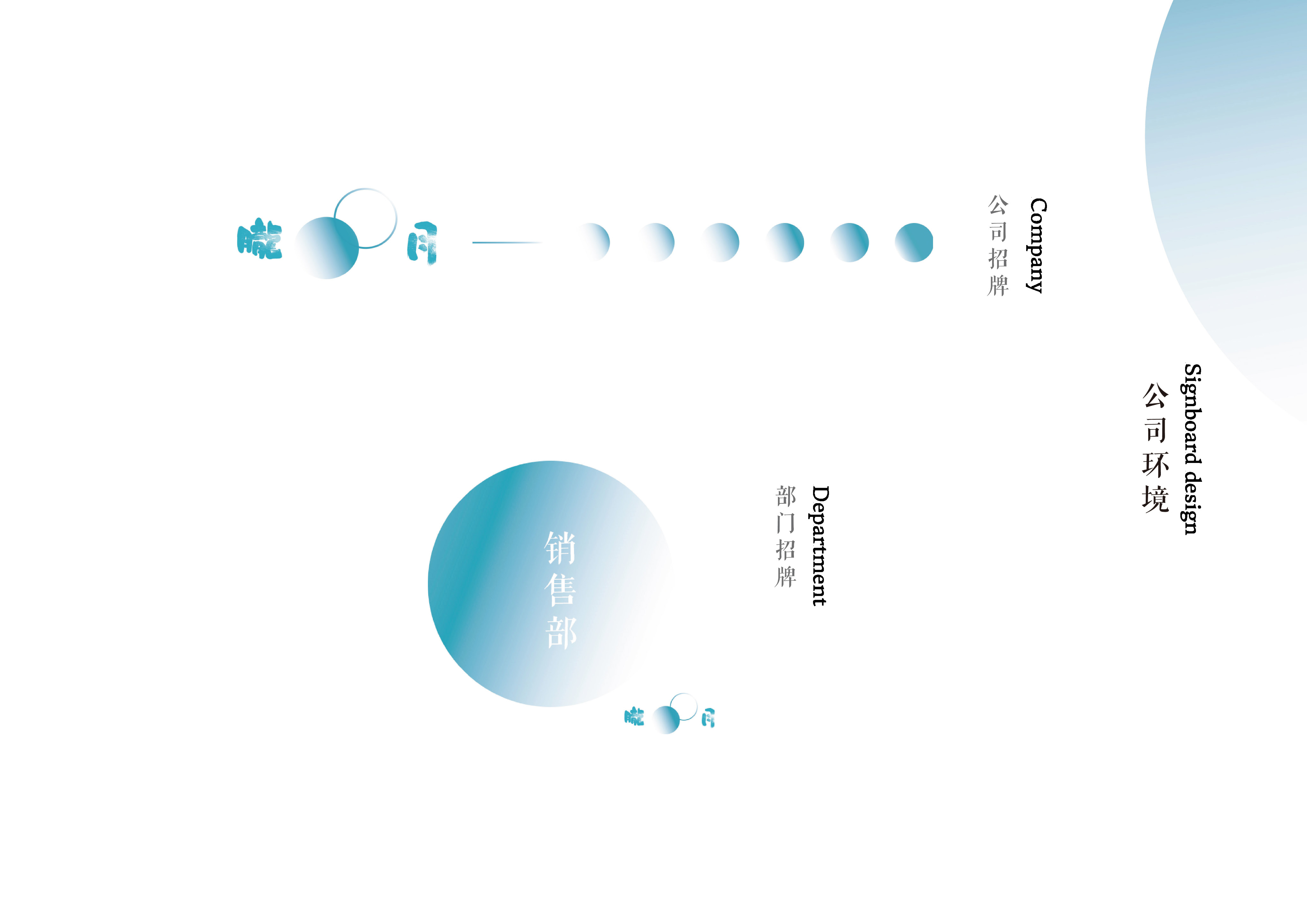
The elements can sit horizontally or vertically. I used a grid to set their proportions and spacing, then extended the moon into a row of smaller phases and larger circular signs.
Adapting the identity across formats
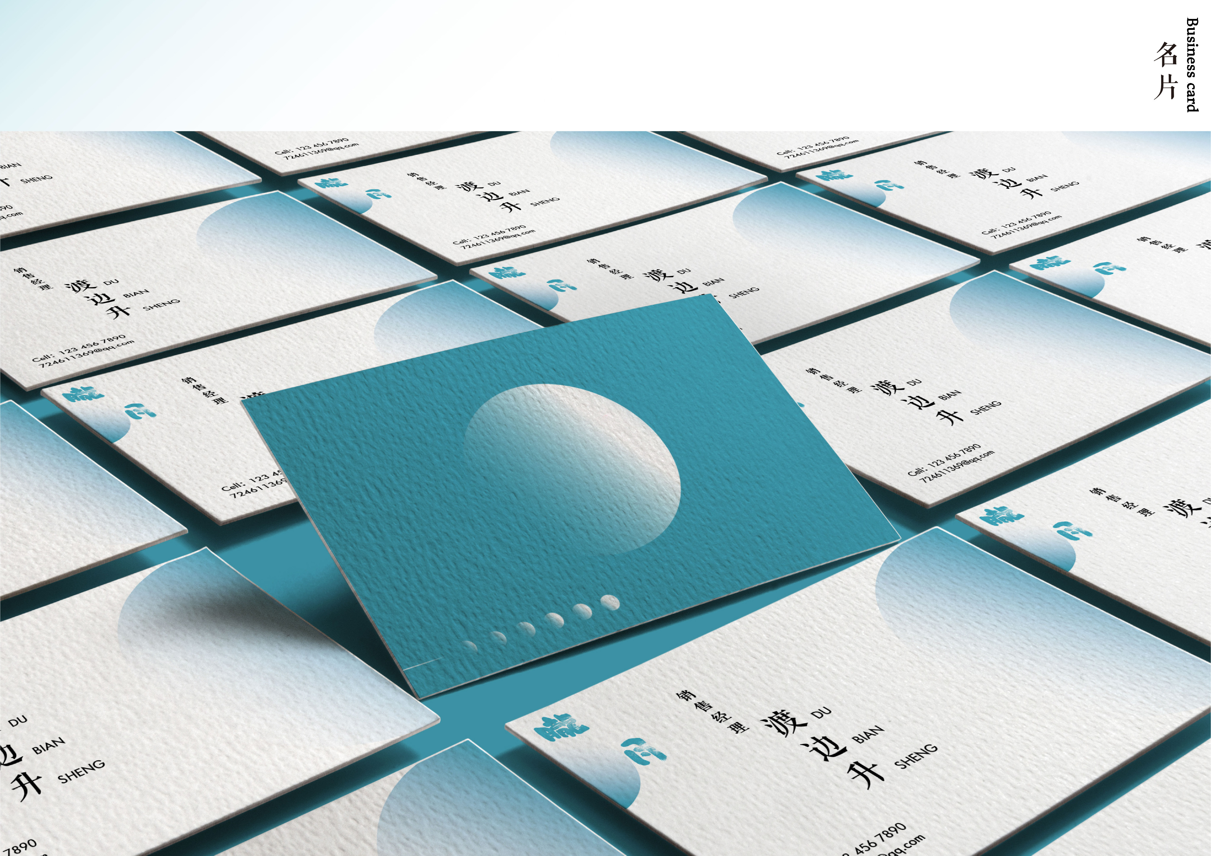
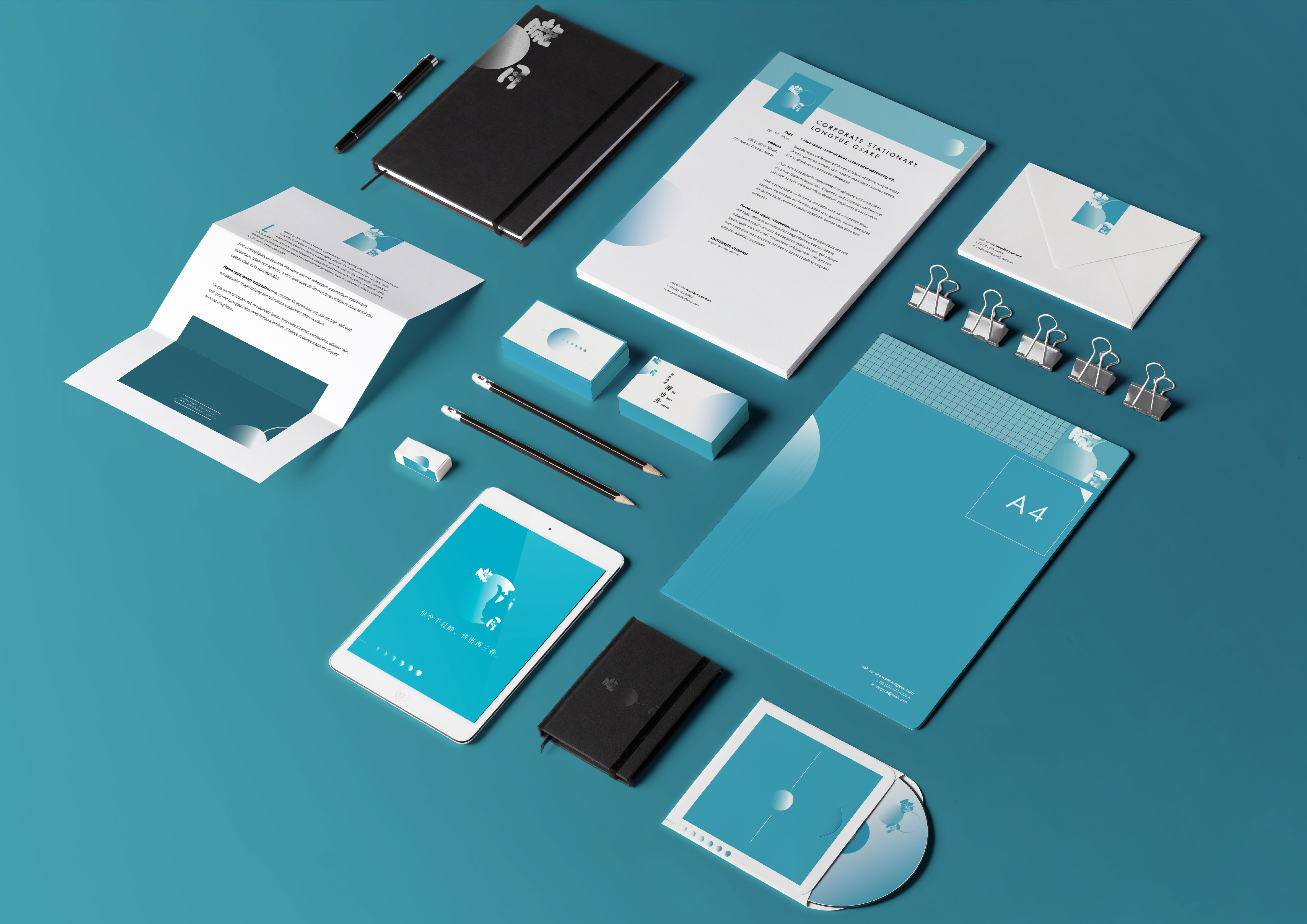
On business cards and stationery, I kept the information separate from the larger moon shapes. Some layouts crop the circle at the edge; others use a small row of phases as a border.
The same elements extend to folders, apparel, vehicles and posters. Changing their scale and placement gives each format its own composition while keeping the teal color and lettering consistent.
From signs to screens
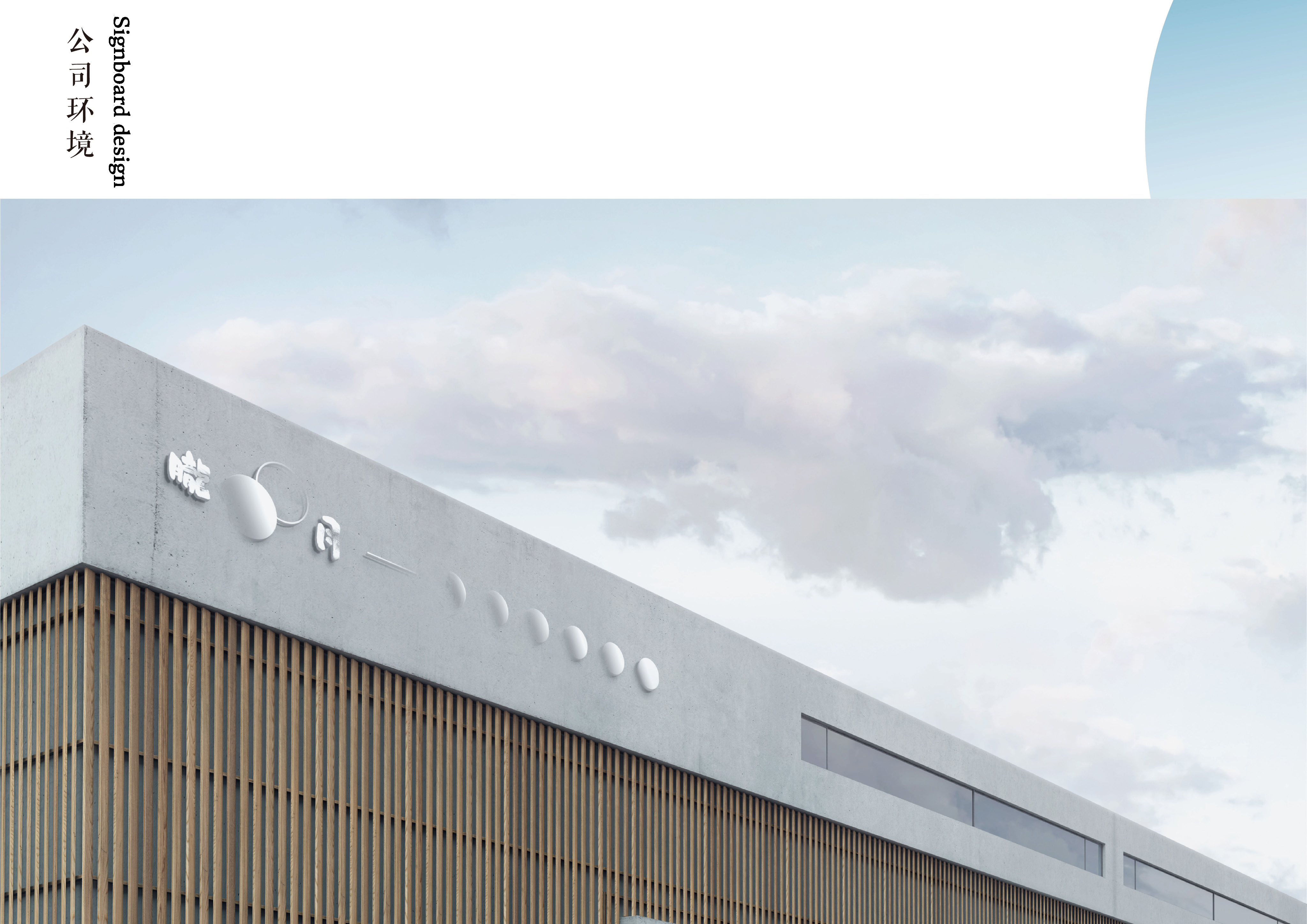
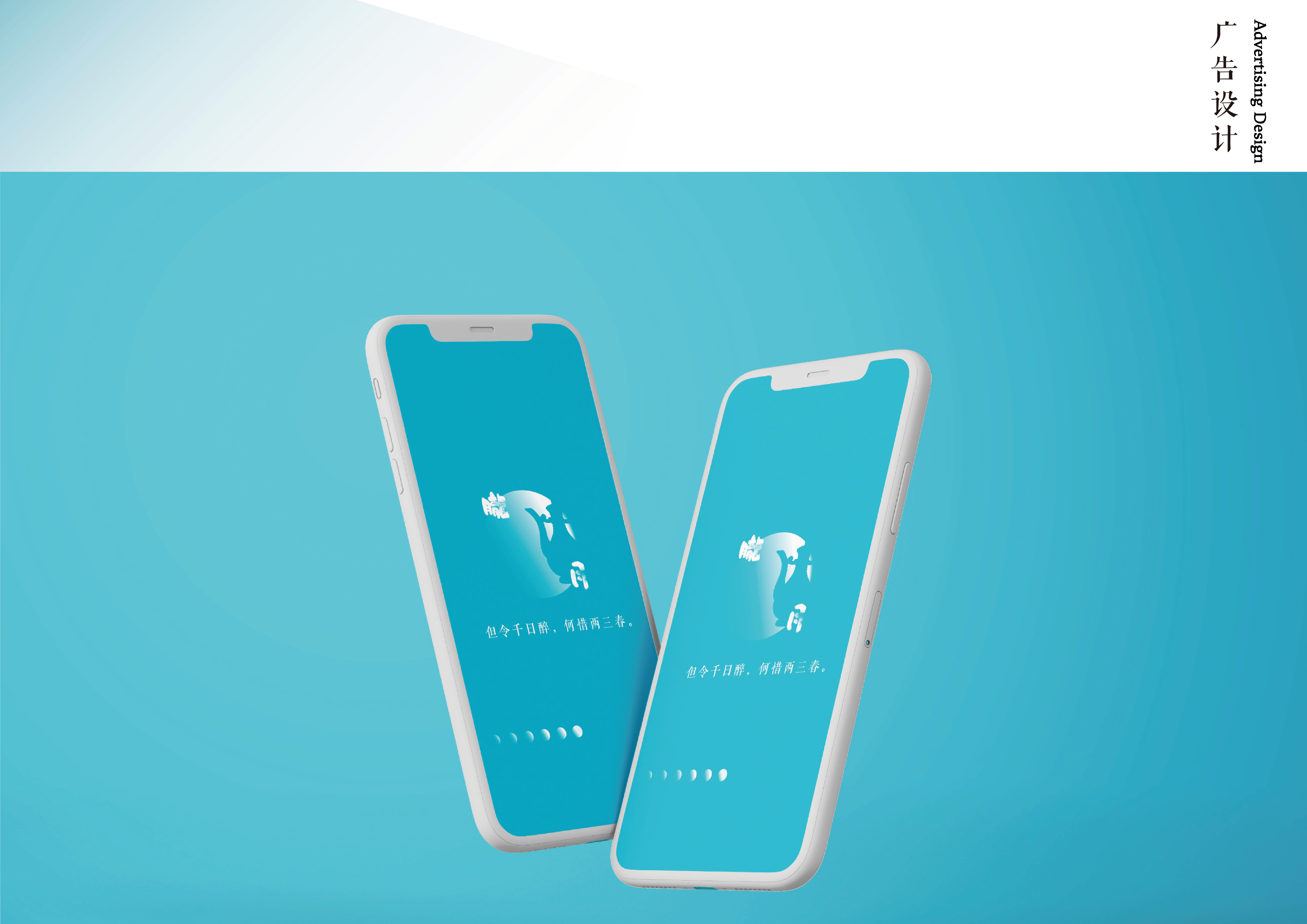
For building signage, the logo becomes the main element. Department signs use a large circular field for the text, while mobile layouts bring back the smaller moon phases. The applications use the same few elements at different scales.