Food and the festival setting
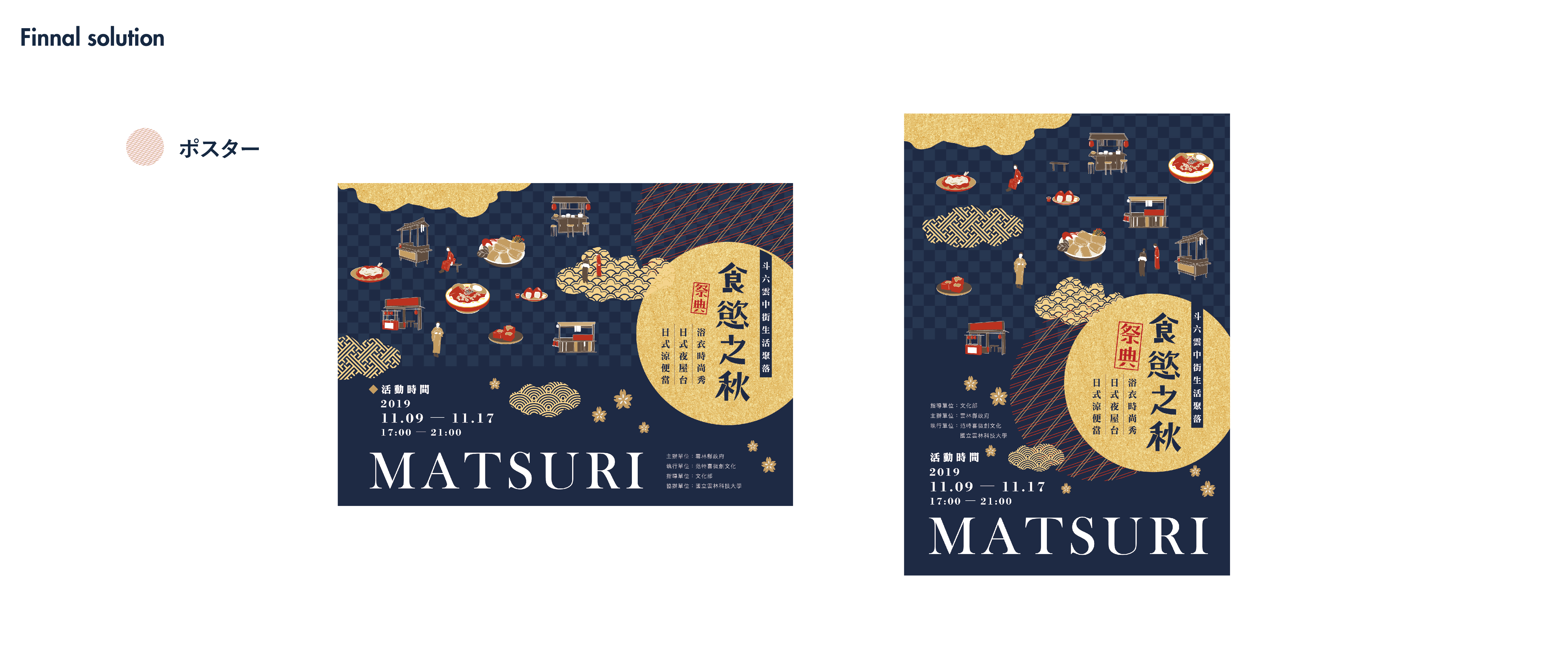
The festival graphics bring its food and setting together. I combined illustrated dishes with stalls and architectural details, then used navy and gold-yellow as the main colors. The title sits in a large circle that repeats across the posters and postcards.
Two starting points
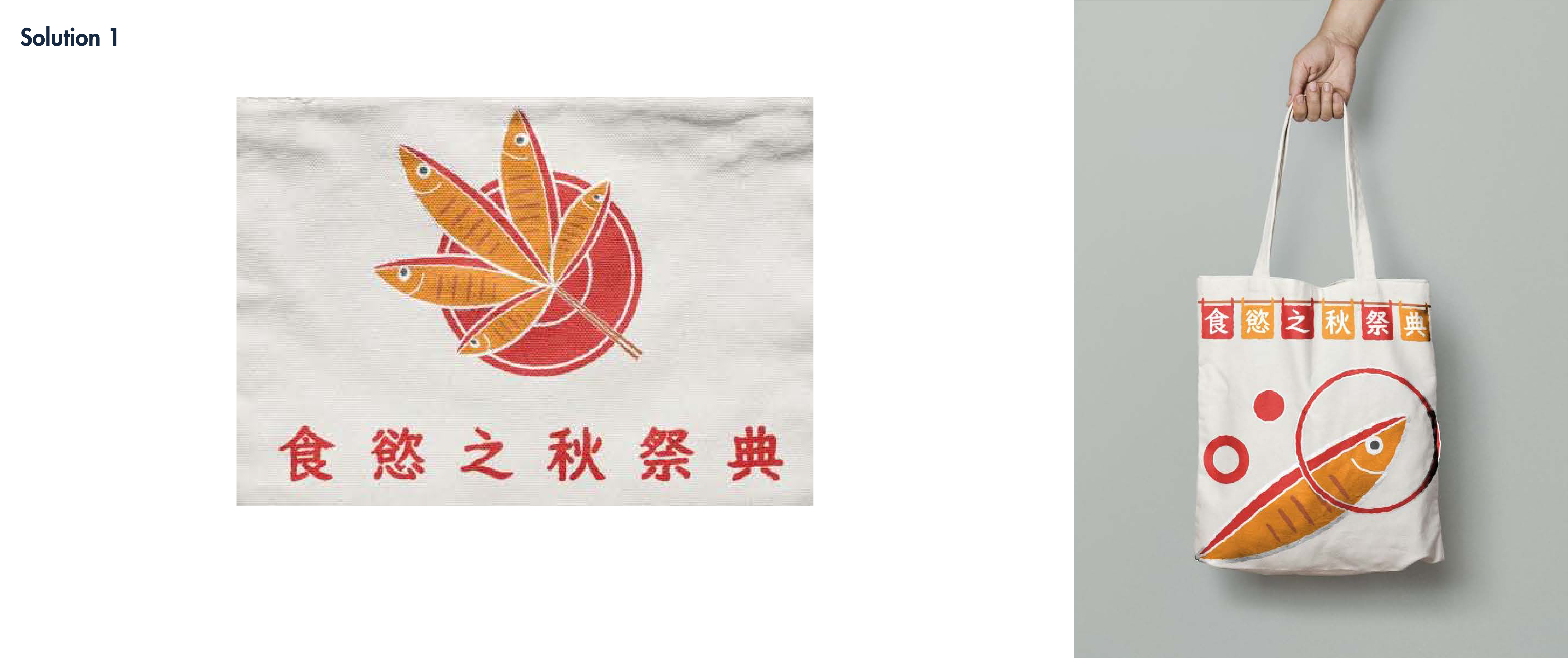
The first direction arranges fish into the shape of a maple leaf. Red and yellow connect the food to autumn, and a single fish becomes a larger graphic for a tote bag.
The second direction brings several dishes and building illustrations into one composition, linked by a flowing blue shape. I developed this more detailed approach into the final posters.
Composing the posters
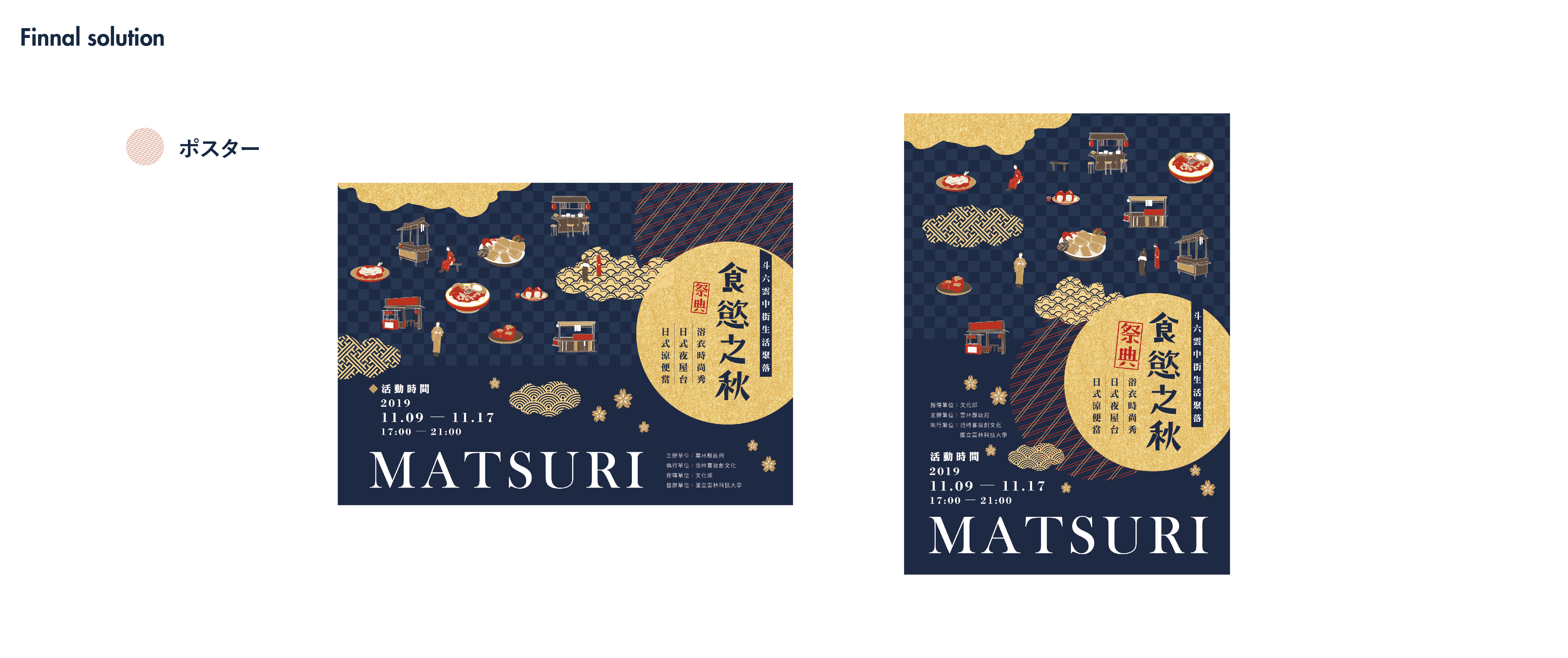
I arranged the dishes, stalls and small figures across a navy background, with patterned clouds between them. The textured gold-yellow circle gives the festival title a clear place in the busy composition.
For the portrait and landscape versions, I rearranged the illustrations around the title and event details. Large “MATSURI” lettering anchors the bottom of each poster.
Postcards and the event
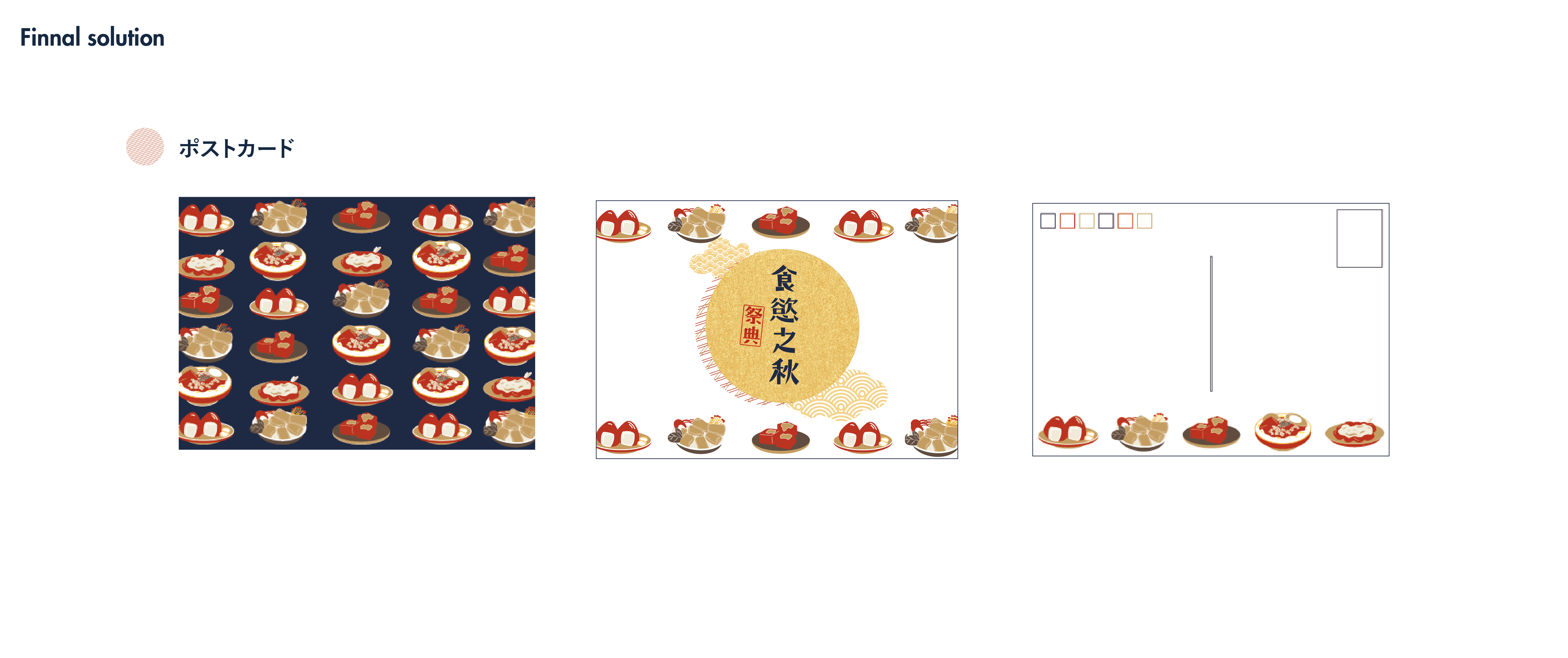
The postcards use two compositions: a repeating pattern of food illustrations and a more open layout around the circular title. On the back, smaller illustrations leave room for a message.
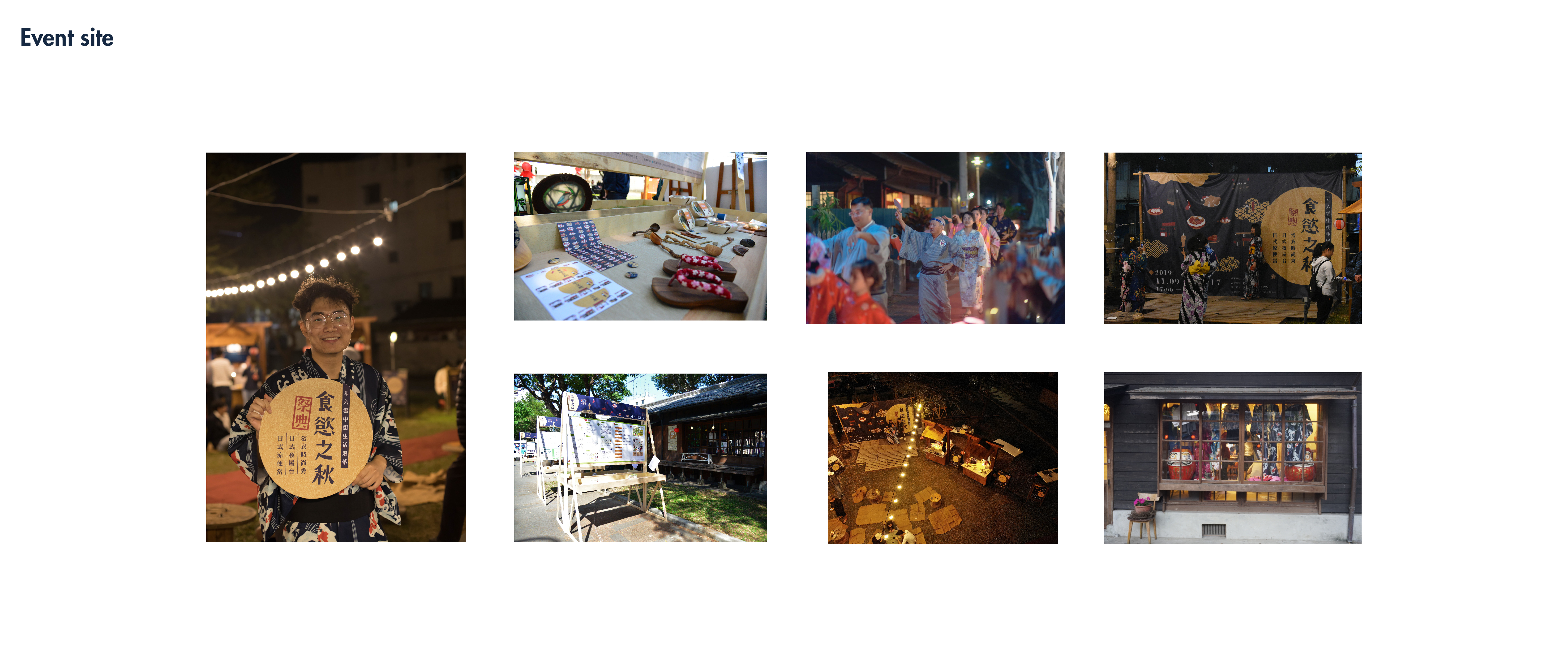
The navy-and-yellow graphics also carry into the festival setting, including a large backdrop and circular title signs.